As we are all very much aware, on April 9th a passenger was forcibly removed from a United Airlines flight, and faster than that plane can fly, the video had already traveled globally via social media. Obviously this blog is not needed to further explore that this was wrong in so many ways, and right in none. But the name of my blog is “The Story Behind the Picture,” and I do believe that this story warrants a look at that picture.
One of the biggest headlines associated with this story was the effect on the price of United stock (UAL) the day or days immediately following. So I decided that this is a good opportunity to actually look at that price action and perhaps add some perspective on what damage, if any, this news really did. After all, the outcry for boycotts and general disdain for the company as a result of this action should all have a profound effect on the stock price and overall value of the company…or so we’ve been led to believe.
And yet the picture seems to tell a different story, and my career has been spent looking at those pictures and thinking about the story for further clarification only after many of my conclusions have already been reached. So let’s look…
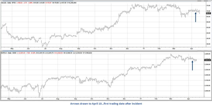
The top chart above is United Airlines stock (UAL); the bottom is the S&P 500 index. The first day that people were able to buy and sell United stock after the incident was April 10th, the date referenced by the arrows. The charts show that these two securities have moved in a correlated manner since early March and actually over the last year at least. In fact, the correlation over the past year is 0.853, where a value of 1.00 is an indicator of completely correlated values, i.e. as one moves the other moves exactly the same. We would look at this 0.853 value as a high correlation. If United’s stock had tanked in the week since this went viral, that number would certainly be lower. The correlation over just that week is even closer to 1.00 as it calculates to 0.957, though we don’t have a very large data set and that’s why I ran it for a year. As goes ‘the market’ so goes UAL.
Either way you look at it, United stock has certainly not performed poorly relative to the broader market measure. Since the 7th, the last trading day before Dr. Dao was dragged from the plane, United stock is down just over 1%. I would not look at this as an indicator that United won’t recover from this debacle. If I was a stockholder, I might even be impressed with how well the stock is holding up. So why even cover this topic if there’s so little going on? Because that’s the point. And that’s why charts are so valuable!
We live in a world of information. I would say we live in a world of TMI – Too Much Information. Especially if you are one to invest based on the fundamentals. When assessing the fundamentals in this case, an analyst would have to go beyond earnings, percentage of seats filled, cost of jet fuel, seasonality, etc. You would be hard pressed to ignore the outpouring of negative press associated with the video and story. But in the end, will it really cost the airline all that much?
There is not much of a warm fuzzy feeling around flying anymore. Forget the business formal dress attire that marked the early days. We no longer have a good feeling about much of anything when we fly. JetBlue serving up free wi-fi, a soda and a bag of chips is as good as it gets. No full meals, free or not. Blankets? Pillows? Bring your own; if you’re lucky the flight attendant can sell you one. Average height or taller? Discomfort awaits. And the cheap fares one might expect from this level of service and comfort has no correlation to what we’re getting. When Peoples Express was created and began our fare wars, at least we knew with them that we were getting what we comparatively paid for. Not anymore.
Flights are packed. All the time. So the risk of United losing many passengers is actually pretty low. There aren’t a lot of other places to go. Fewer airlines and fewer flights translate in the real world to book whatever you can get. Spring break is one or two weeks. We all need the flights at the same time. Whether it’s JetBlue or United, most of us will choose the least expensive at a somewhat convenient time. And if that’s United, then United it is. Same price, same time? Sure, I’ll choose someone different. But I rarely get that luxury.
And all of this information is contained in the top chart of UAL stock price. Per the chart, this is not a big breakdown. There has not been a mass exodus of stockholders, and those that chose to sell based on the news, the fundamentals, may very well buy their shares back soon. They certainly aren’t looking in the rear-view mirror declaring victory. The consumer? Even less victorious. Because while United has changed some policies based on what happened, our personal flying experiences will not improve all that noticeably. So what seemed to be extremely impactful news is really more of a snooze.
Don’t take my word for it, look at the chart. Numbers don’t lie, as the saying goes. And all of our negative sentiment is reflected in the price move, or lack thereof. So listen to the news, check your Twitter feeds. Find out The Story Behind The Picture. But don’t lose sight of the picture when doing it, because your best information is right in front of you; and as mentioned in a previous blog, you don’t need a business degree to interpret it.

Great article and analysis. It read well the whole way through.
LikeLike
Thank you Douglas. Comments are always welcome, compliments always appreciated.
LikeLike